Disclaimer: this is a repost of something I did back in 2016
During a recent project innovation sprint at a customer, we decided to tackle our customer’s data warehouse documentation problem. It was hard to get proper insight in the data streams at hand due to various data sources, changing standards and legacy code. Take for example a random field: in which reports is it being used, to which source can it be tracked, which transformations have been applied, etc?
Since our aim was to thoroughly reshape the infrastructure, we decided to add this kind of information because it would allow us to better gauge the impact of our modifications. During the innovation sprint, we developed a system that builds said info and makes it possible to query.
Oracle Data Integrator and Neo4j: a love story
Oracle Data Integrator (ODI) is a tool that allows you to easily set up ETL flows between various database systems and technologies. Interfaces are probably the most important concept in ODI. They define the data flows between one or more sources and targets.
All metadata ODI uses to execute the various ETL flows is stored in a database. From the structure of the various data sources to the definition of the interfaces and the connections between various fields: everything is available via this metadata. Following some research into the underlying structure, we were able to extract the necessary information by way of a few simple queries.
After extracting this info, the next hurdle was to offer it so it’s possible to run queries on it. Because our documentation will be used not just by people with a technological background, a clear visualization is necessary. Filtering and targeted searches are also very important, due to the large amount of fields and their interrelatedness.
When thinking of persisting and presenting relations, one almost always ends up at graph databases. These databases use graphs to shape the connections between various concepts. One of the best-known graph databases is Neo4j. The community is freely accessible.
The results of our queries on the ODI repository were saved as CSV files. Neo4j makes it very easy to read those CSVs and to transform them to a graph structure. With larger datasets, the import tends to take a long time though. In that case, directly loading the data through the Neo4j Java API may be more performant.
The basics: schemas, tables, fields and mappings
To start, we can map the tables and their corresponding fields for every schema in the data warehouse. These become the nodes on the graph. The relations between this first set of nodes are quite simple: a field belongs to a table, a table belongs to a schema.
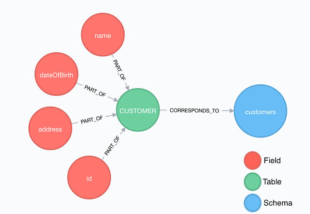
Based on the existing set of nodes and relations, it’s not possible to make connections between the various fields To solve this, we need an extra type of node: the interface.
The interface symbolizes the operation in which one or more fields from the source tables are mapped on a field in the target table. From this, you can immediately extract the various relations. The USED_IN relation is used to show that a table is used as a source in an interface. Similarly, the FILLS relation is used to show that a table is used as a target in an interface.
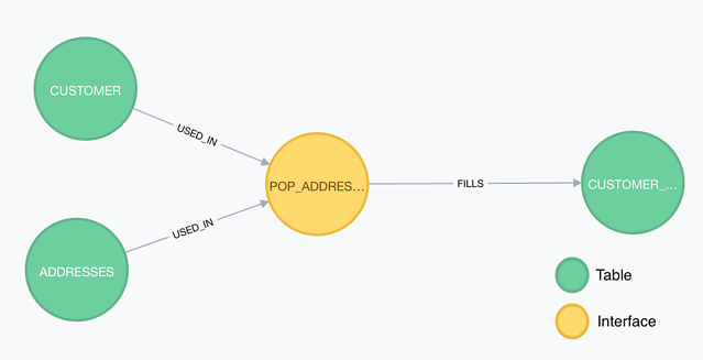
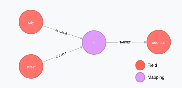
By way of the interface node we can already extract a large amount of information from the graf we’ve built. But we can go a step further than that, namely by extending the interface node to the level of the fields so we can shape the relations between the various fields and tables. This results in the mapping node.
Unveiling endless possibilities
The real power of the graph shows when we want to look into the main structure of the data warehouse or when we want to make targeted impact analyses.
Mapping the structure of the metadata
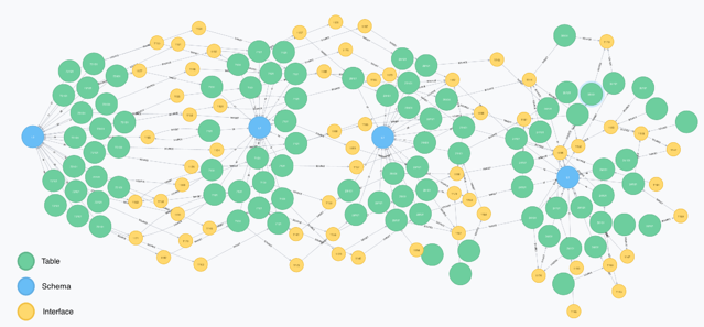
The defined concepts and relations allow to easily map the structure of the data warehouse. The image above clearly shows the structure of the data warehouse for a specific subject area. The data starts from the source on the left and flows via the various ETL processes (created using mappings) to the third layer of the data warehouse on the right.
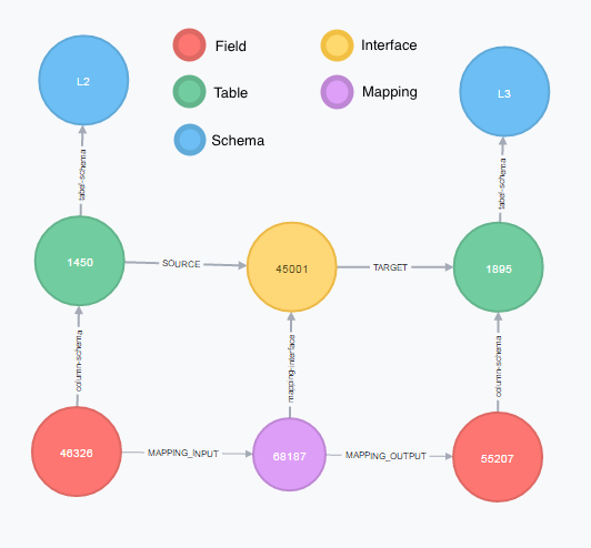
A question often asked by end users of the reports is what the meaning is of the fields included in a report. If, for example, the report contains a field that denotes the profit of a certain month, then it’s interesting to know where this field comes from and how its value is being calculated through the full ETL flow. We can simply deduct this info from the graph we’ve put together. The image above shows an example of the flow of a field from the second layer to the third layer of the data warehouse.
Impact analysis
It frequently happens that a data model in the source applications is being changed, that a certain data source is no longer included or that the structure of a source table is modified. In these cases, it’s convenient for analysts and developers to know what the impact is on the current data warehouse structure.
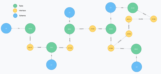
Using the generated graphs, it’s possible to get a clear view of this impact. The above image shows the flow for table 73101. It begins on the first layer of the data warehouse and flows all the way to the third dimensional layer. The graph clearly shows which mappings and tables are used to enable this specific flow.
The graph allows us to clearly and quickly visualize what the impact may be if we were to stop delivering table 73101 to the source and it’s immediately clear which mappings need to be changed and which tables will no longer be loaded completely.

